The kitchen is practically, almost done! I’m not sure that it will ever be “done” but at this point it’s close enough to call the project complete. This has been a giant project for us. We did everything ourselves, except outside brick work, wall texture, and countertop installation. So, now it’s reveal time! I can’t wait to share it!
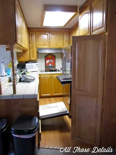
Yes, if you opened the dishwasher, fridge, or oven while someone was at the cooktop they would be trapped!
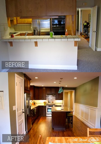
First lets take a look at the kitchen before and what we were working with. I’m pretty sure this layout is the definition of the “one person kitchen”
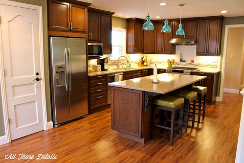
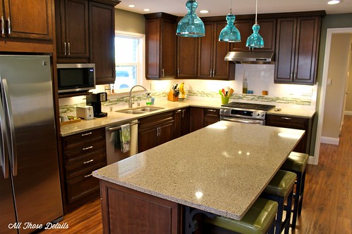
Now here’s a picture from taken as it looks now…
Pretty sweet huh? With the old kitchen, I imagine the builders of the house reaching the end of the build and realizing they forgot to put in a kitchen (“hey, lets just stick it in this dark corner and build walls all the way around it!”). Now the house layout makes sense. Open, but not too open. I think the living space looks much bigger. Here are the before and after floor plans for comparison…
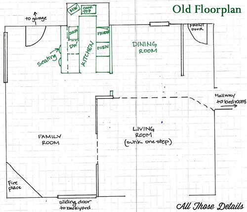
Basically, two living areas – living & dining, then family & kitchen. They were pretty much totally separated
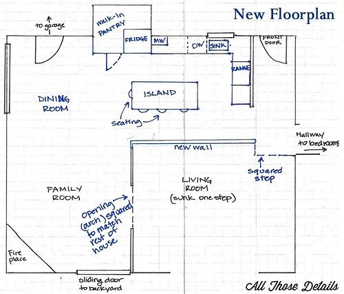
Now the living space is still in two parts, one big upside-down “L” with the kitchen, dining & family rooms. The living room is separate, which is great for movies and when we have two things going on at the house at the same time
Over the course of the project, I tried to take pictures from the same spot, for comparison. Below is the before and after taken from the large window next to the door to the garage/laundry room (far left of floor plan drawings).
Can you believe that’s from the same spot? It looks like a totally different house. I have to admit, this whole project turned out WAY better than I could have imagined!
Below is the view standing at the door to the garage/laundry room looking straight to the sliding door & fireplace, or the “family room” as we’re calling it. Does it look bigger, or is it just me?
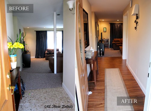
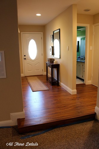
Below is the before and after looking in the front door. That tile was a huge pain to get out! Having continuous flooring really makes the entryway look so much longer (plus we added about 12″ but pushing out the step to the living room!)
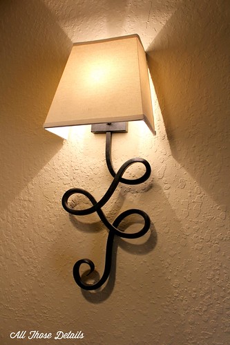
I just love our new entryway sconce! Simple yet interesting. And it acutallly lights up the space; Yes, I’m easily pleased.
Doesn’t that nice square step look great? Forgive the cable running under it, we’re still deciding how to layout furniture so wires are all over the place right now. Before that curved step cut into the hallway, which meant I tended to fall off the step frequently. No more!
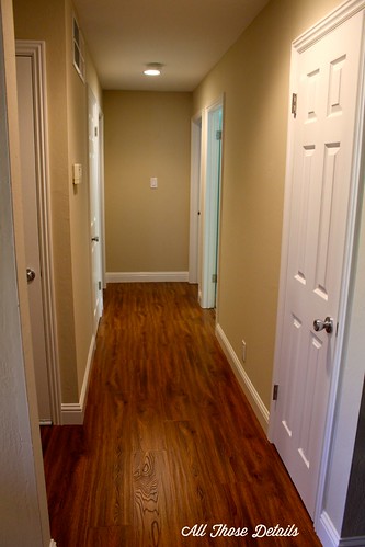
This is the hallway. We repainted the doors, updated the door trim and touched up the walls. Well, plus the new flooring. Again, it looks much longer. I’d love to hang something at the end of the hallway, but haven’t found anything that doesn’t make the un-centered light switch look even weirder.
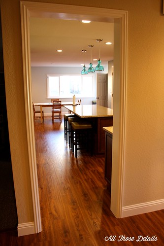
From the previous picture, all I did was turn around 180-degrees. The front door is to the right. This opening is new, the wall used to end about 18-inches to the right of the current opening.
So… this is what it used to look like from about the same spot. This picture is looking more to the left. The new wall is basically where the long step & post were.
The new wall we built from the other side. I’m standing where the old kitchen used to be.
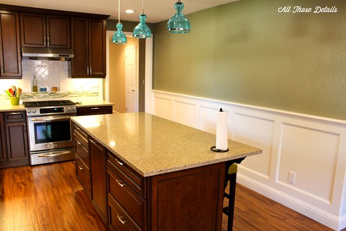
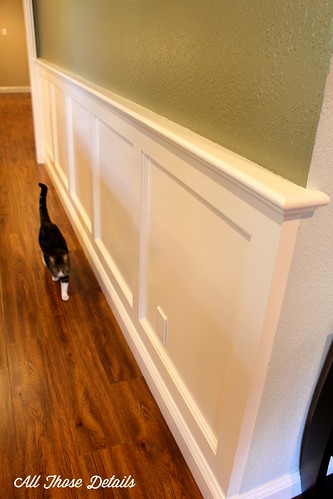
The new wall was going to be so big + we wouldn’t be putting any furniture against it = big empty monster. To break it up and make it more interesting we decided to add wainscoting-type trim. The entire new space was painted light blue, but the trim didn’t stand out so we decided to change the color of the kitchen area to a olive green. Both colors came from the mosaic tile in the backsplash.
Didn’t the trim turned out great. The Boyfriend did an amazing job (plus I sanded it like a pro)!
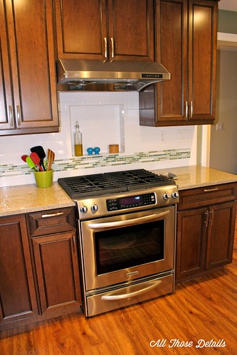
Working our way counter-clockwise around the kitchen, we have the range. We decided on a gas cooktop and electric oven. One of my favorite details is the little nook we built behind the stove.
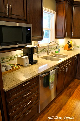
Since this part of the space used to be the dining room, we had to decrease the size of the previously large window. Although it used to be larger, we usually had the curtains closed and hardly ever spent time in the front part of the house. Now, we actually get to see the neighborhood! The new window also lets a lot of light in.
We even have enough countertop space to have a little breakfast station.
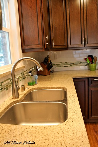
When we were making a wish list of what we wanted in our new kitchen, one of my priorities was “no seams”. Before we had tile countertops, and lots of nooks and crannies that made it really hard to keep it clean. Now look… so smooth! I love how the quartz countertops lead directly into the undermount sink. Wipe those crumbs directly down the drain!
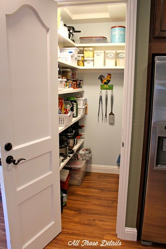
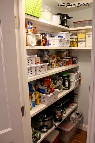
About half of the old kitchen space is now a walk-in pantry. I’m still in the process of organizing it, and frankly I’m overwhelmed by the possibilities!
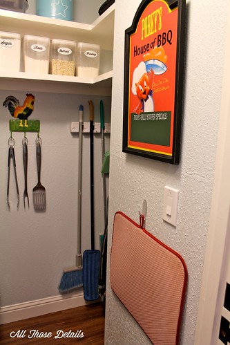
Of course, we had to find a new home for our Porky’s sign (which is a little bit cannibalistic). The red thing under it is a dish drying mat. You can see in the corner is space to hang our brooms, and store the vacuum. Thinking ahead and planning a spot for them was one of the best ideas we had. Before they were in the garage, and were always getting dirty.
How do we have so much food for two people? No idea. But soon it will be organized and beautiful!
Now, for a few of my favorite cabinet details. There are so many cool cabinet-insert options. If you are buying new cabinets I would highly recommend taking a look at them!
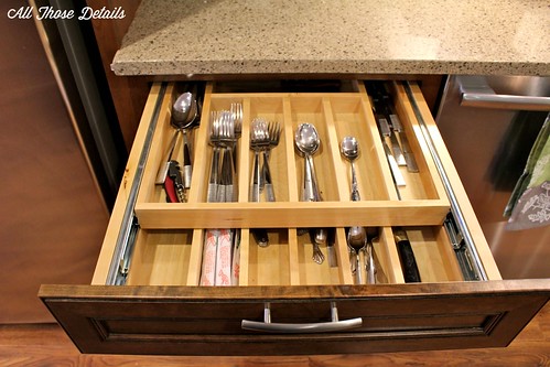
First up, it the double layer silverware drawer. The top tray pushes back completely to reveal another identical tray below it. This is great for serving spoons, spread knives, and grapefruit spoons.
The garbage & recycling bin! We put this in the middle of the island, which is easily accessible from everywhere. Before our garbage was actually outside the kitchen. Yeah, this is a huge improvement.
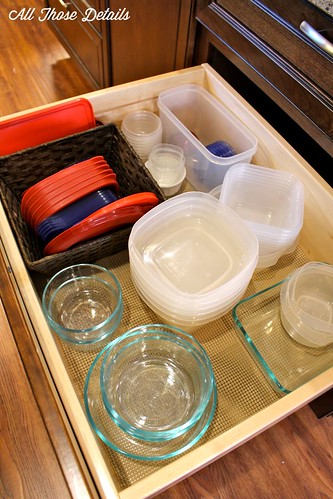
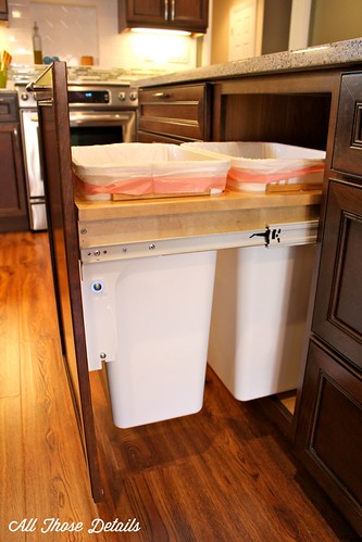 On either side of the garbage/recycling cabinet are deep drawers. On the left side we filled them with pots and pans. On the right side, we have a tupperware drawer. Over time I have been trying to standardize which containers we have, which makes them much easier to store. I used a little basket to hold all the lids. Opening this drawer makes me smile 🙂
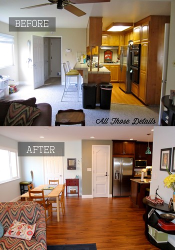
So, here is the before and after as I stand in front of the sliding glass door. I never understood the weird space in front of the window. It wasn’t really big enough for anything. We took advantage of that extra space, which left room for a dining room table after we moved the kitchen into the former dining room.
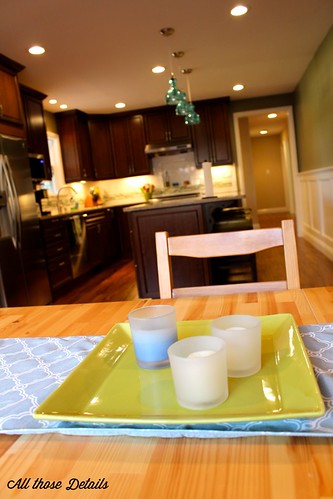
This is the view from the dining room table. My favorite seat in the house!
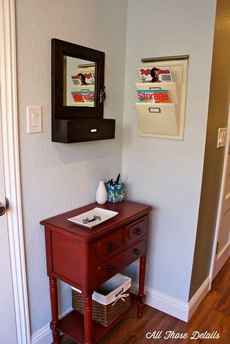
Our back door drop zone. We have a spot for our mail, a couple hooks for keys (on either side of the mirror) and a tray for pocket-contents. You’ll notice the contents of The Boyfriend’s pockets include, change, a couple of bolts, a nut, and a countersink drill bit. Isn’t that what everyone carries around? We have drawers for take-out menus, coupons & note pads for grocery lists in the red cabinet.
Here’s the new view from the drop zone. The best thing to come home to!
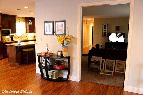
Standing at the fireplace, this is the view now. You can see we have a wall art hanging project going on in the living room. The opening to that room used to be about a foot bigger and arched (which was not symmetrical!). The squared off opening matches the style of the house much better.
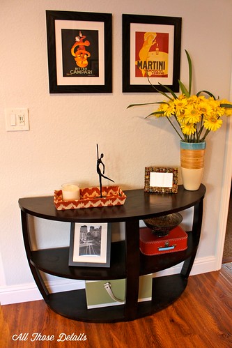
We call this the “small wall”. I’m still playing around with decorating – that little picture frame is still empty, oops!
While we really love the chair-in-a-half in front of the fireplace, we’re looking for a small couch to add some more seating. Also, it definitely needs to be reupholstered! The footstool was sitting outside for 10 months (yes, that’s how long this all took!) and it’s pretty faded. Plus, faded or no, the pattern in pretty hideous!
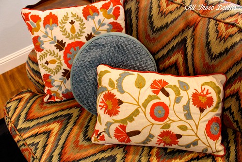
My color inspiration for the family and dining room are these pillows, please ignore the chair’s ugly pattern! I’m still looking for rugs, a coffee table, and curtains.
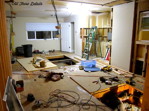
This is just a reminder of what we went through… Ugh, I’ve already blocked it!
Ah, much better! I can’t believe it’s finally done!
Now i’m off to go cook something. Ok, just kidding! I’m really just going stare at the pretty countertops and order take-out because I don’t want to mess it up!
If you want to peak back at the kitchen remodel in progress…
Part 1: The BEFORE
Part 2: Demo
Part 3: Rough Construction
Part 4: Walls & Floors
Part 5: Functional, but still not done







It looks amazing!
Thanks Jen!
My mind has just been expanded! Thank you for sharing the details and letting me take a peek. I want to remodel our kitchen and this gave me some great ideas. When we finally get around to the remodel, I may be giving you a call for advice, or just to sob because it’s taking so long. 🙂 You’ll give me hope that the work will one day end.
Definitely call, i’ll provide as much moral support as I can! It was hard to live through, but the outcome is so great we’re already forgetting those bad parts. For me, one big help was taking breaks throughout the process (a weekend away, doing something fun with friends). Although it made it last a little longer it was huge for our sanity. You can do it to!!
AMAZING work!!! Congrats and enjoy!!
Thanks Val!
Sarah, you’ve outdone yourself! That pantry is unreal and I love your trash solutions! May I ask what you (and possibly your boyfriend’s) background in handiwork is? Do you have a history of home repair or did you put in a lot of research?
I had a big advantage in this project because The Boyfriend is actually a carpenter and general contractor (yes, I know it’s cheating). Since he had the technical expertise, I ran the logistics (design, material research, budget & making sure we got fed), and also played assistant to him. I think a lot of the work would be totally do-able for a non-professional with some research. The floors were pretty straightforward, as was the sheetrock, tile, demo & cabinet installation. Electrical, gas, plumbing, I would definitely leave to the professionals. One of the biggest helps in the design was stretching out a bunch of ideas and then showing our friends. We never would have come up with this layout without their input!
Wow, that looks great! You guys did a great job. The old kitchen is so weird, like you said, oops we forgot the kitchen, lets just put it here!
Thanks Mary! Our neighbors actually have our same floor plan (and raised a big family with that tiny kitchen!). After seeing our transformation, I think their reno is on the horizon!
I found your blog through a search for camping lists (thanks for those!). Then I noticed your kitchen remodel…WOW! You guys did an awesome job! It is fantastic!